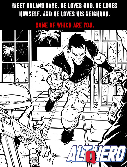
 This image will be the basis of the cover of AH:Q Issue #1. Back the campaign.
Tags:Alt-Hero: Q
One Comment
The firearms are very realistically rendered (unlike most American comics) but I’m not a fan of that shooting stance at all. I guess it’s supposed to look dynamic rather than realistic but I don’t it does that very well either.